How To Make a Contact Us Page On Shopify (with the best practices and examples)
Whenever you want to get to know more about a business or a store, you immediately click on one of two tabs. About us or Contact us.
Today, we’re going to deconstruct the latter.
Contact us page is the backbone of every proper eCommerce store website. And in this article, you’ll learn why you should have a Contact us page, how to make a contact us page on Shopify along with the best practices, apps, and examples.
After reading this piece, you’ll be able to make a contact us page for your Shopify store and make your online store stand out from the crowd.
Table of contents:
- Should you have a Contact Us page and is it important?
- How to Create a Shopify Contact Us Page
- SPAM and filtering of your Shopify Contact Us Page
- Best Practices for Your Shopify Contact Us Page
- Shopify Contact Us Page Apps
- Best examples of Contact Us page
Should you have a Contact Us page and is it important?
Well, a contact us page is not a necessity (you don’t need it to run an online business), yet it’s more important than some people may think.
Firstly, the Contact us page makes you a legit business in the eyes of the visitor. If there’s a real way to contact you (phone, email, etc.) it means there’s someone on the other side.
Also, when you give your customers a way to contact you it means you’re open to a conversation. This means they can get in touch with you if there’s an issue with their order. Nowadays, with tons of eCommerce stores all around the world, it’s really hard to embody trust and show your potential customers that it’s safe to make a purchase from your website. Contact us page is one (if not the best) way to do so.
All in all, you don’t need a contact us page on your Shopify store but you definitely SHOULD have a contact us page.
Plus, as you’ll see in the next paragraph, we’ll show you how to create a Shopify contact us page. And it’s not that hard!
How to Create a Shopify Contact Us Page
Now that you know that you should have a contact us page on your Shopify store, let’s move to the creation aspect.
It’s really easy to make a contact us page on Shopify and we’ll cover it in four easy steps.
First, go to your Shopify admin page and navigate to Online Store -> Pages -> Add page.
There, type in the name of your page (Contact us) in the Title section and add any text you’d like to be displayed on the page in the Content section.
Now, go to the Templates section and select page.contact in the Template suffix section.
Click save!
That’s how easy it is to create a Shopify contact us page.
Keep in mind that depending on the Shopify theme that you’ve installed, you might have to add the page to your navigation menu in order for it to be displayed on your website.
Now that you have your brand new Shopify contact form, we’ll show you how to deal with SPAM and unwanted messages.
SPAM and filtering of your Shopify Contact Us Page
Luckily, the SPAM attacks on small online stores are yesterday’s news. Still, let’s take a look at how Shopify makes it easy for you to avoid unwanted messages.
First of all, when it comes to messages sent through the form that (by default) will be sent to the email address listed in your General settings, Shopify will mark all the SPAM messages with the [SPAM] flag so you don’t have to bother with them.
Secondly, to make sure that no robot sends you an email, Shopify lets you add a CAPTCHA or “I’m not a robot” checkbox to prevent bot-made SPAM attacks.
After all, you can never be sure that some crazy people won’t exploit your phone number or so. The best way to prevent your personal information from leaking to the public (or simply being exploited) is to use a virtual phone number. You can showcase such a number on your website and redirect it to your personal phone number to take phone calls from your smartphone. No risks of exploitation!
Now that you know how to stay safe with your contact us page, let’s explore the best practices to build one.
Best Practices for Your Shopify Contact Us Page
Okay, now you know the why and how it’s worth exploring the what.
And that’s why we’ll go through the best practices for your brand new Shopify contact us page.
Again, we’ll keep things really simple so you can apply them to your online store with ease.
Choose the goals of your Contact Us page
Contact us page can serve many purposes. You may use it to help your customers in case of an issue. You can capture new sales leads with it. Or you can even turn it into a PR or HR machine.
Whatever you opt to do with it, choose the goal(s) and make it clear for anyone who visits the page.
Of course, you don’t have to settle for just one of the earlier mentioned goals. No.
You may, with success, use it as a way to serve your clients, capture leads, and get press. All that’s required is clarity that will guide each of these personas to the right point.
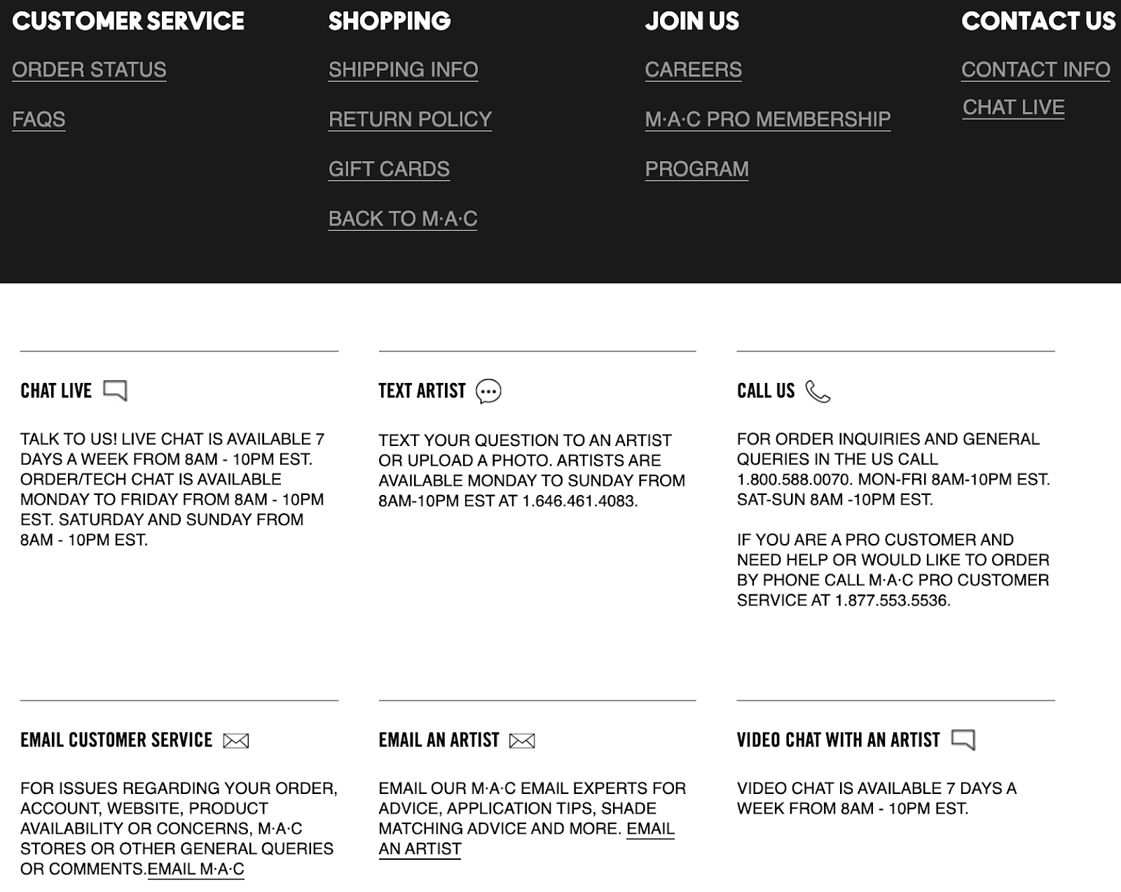
Take a look at how MAC Cosmetics deal with the multi-purpose Contact us page.
They give different directions based on the purpose of contact. This way, their visitors can quickly navigate to the right point and use the right way of contact.
Encourage the right kind of contacts and use reCaptcha
We’ve touched on this already but it’s important enough to mention it once again.
It’s rare these days to see the harsh exploitation of a contact us page, yet, it’s always better to be cautious instead of having to fix things yourself.
Thus, we hardly encourage anyone to use reCaptcha and I’m not a robot checkbox. This allows to eliminate a majority of SPAM messages.
Another way to deal with exploitation, this time in regards to yours (your company’s) phone number is to use a virtual phone number. In Channels, you can get a toll free number or any other version of a phone number to showcase in place of your personal phone number.
This way, your personal phone number won’t ever get exposed and you’ll feel safe instead of worrying about phone calls from unknown phone numbers.
Make it Easy to Find
No matter what the purpose of a person visiting your Shopify store is, if they have hard time finding what they want, it’s likely they’ll quickly bounce. And the same goes for finding a Contact us page.
To prevent that make sure it’s very easy to find.
You can achieve that by using proper placement and wording.
Firstly, there are two spots in which you should consider adding your Shopify contact us page. The first one is the top navigation bar. If you don’t have too many of the tabs already linked there, consider adding a contact us page in there.
The second spot in which you can include your contact information in is the footer. There, you can either link the contact us page or just showcase the contact details. If you scroll down, you’ll see how we’ve dealt with that quest.
Secondly, you have to use proper wording.
In this article, we’ve been referring to the contact us page. Yet, there’s more than one way to name it. Phrases like Contact us, Contact, Support, Customer support, Customer service, Help.
All in all, don’t make it too tricky to find, both in terms of the placement and the wording.
Keep it Short
This principle is the follow up to the previous practice. Just as everyone wants to find your contact page quickly, they want to have the same experience after they access it.
This means that your contact us page should be concise and consist of no more information than needed.
Many businesses fall into the trap of repeating stuff that should be used on their About us page inside the Contact us page. Even worse, as some people treat the contact us page inversely to the about us page.
Don’t make this mistake.
Treat your contact page as the quick manual. A manual should consist solely of information needed to perform a certain task and to get to a specific goal. Here, it’s getting in touch with the right department using the most appropriate solution.
Thus, remember to keep your contact us page short and include details that HAVE TO be there.
Include Contact Information
This point is quite self-explanatory but the real purpose of this practice is to remember to add all the information you can.
Different visitors will require a different approach. Some people prefer contacting over the phone, some would like to send an email, while others want to have a visit in your local store.
And because of that, it’s wise to include all contact information in your contact us page. This may include:
- Your phone number.
- Your email address.
- Your physical address.
- Opening hours.
- Operating hours.
- Estimated time of response (each for a specific solution)
- Social media handles
- Your live chat (either link or instruction to access)
Make sure all your visitors are satisfied and know how to get in touch with your company.
Add a Call-to-Action
Call-to-Action or CTA is a well-known phrase in the world of marketing and sales. Yet, it can also be an important part of your contact us page.
How?
Well, including a proper CTA is the part of making the instruction clear-enough so your visitors will know what to do next.
Instead of using a generic CTA like Submit or Send you could, based on the purpose, use such CTAs as Get help, Call now, Get in Touch.
At first, it might seem like there’s no real difference. But the words you use will wildly change the way your visitors interact with your contact us page. For example, Get help indicates the intention behind sending the message. And Call now gives the visitor two pieces of information; 1.) they know they can contact you at this moment and 2.) they know what solution to use in this particular case (the phone).
Use CTAs to make your contact us page clearer so all your visitors leave it satisfied.
Show Off Your Brand’s Personality
While the contact us page is not the right place to talk about your brand (remember, keep it short) it doesn’t mean it shouldn’t embody your brand’s personality.
What happens is that many businesses use almost blank and generic contact us page and make it look like a separate part of their website. And that’s bad.
Your online store’s website should be a coherent piece. All of the pages should fit in nicely and create a feeling of brand consistency. Therefore, don’t forget about proper wording, visual, and your brand’s personality and identity while creating a contact us page.
Plus, remember why you should have a contact us page at first. To create trust, right? And a generic, almost blank contact us page might simply not do the job…
Enable Autofill
While browsing the web you fill in dozens of forms and it’s almost the same information over and over.
So, to make this process a bit less tedious for your visitors it’d be wise to enable autofill. This allows your visitors to insert almost all of the generic information in one click.
After all, the chances are they’ll want to use the same name, surname, and email address as they’ve used previously. Thus, to make the process easier and quicker enable autofill and make this experience more pleasant for your customers.
Make Sure it’s Mobile-Friendly
Nowadays, almost half of all eCommerce transactions are completed using a mobile device of some sort. Yet, the way your mobile visitors interact with your website is vastly different from how desktop users do it.
That’s why you should make sure your contact us page is mobile-friendly. This means it should scale properly to the size of a mobile screen and “adjust” its looks based on the device it’s viewed on.
Firstly, it’s much harder to type on a mobile device compared to a desktop or a laptop. With that in mind, you should make the input boxes a bit bigger and more accessible to be accessed with a finger tap.
Secondly, because tapping is much harder, you should make buttons more visible and clickable.
All in all, it’s about making it as easy to access as possible. No one wants to waste their time filling a form or trying to click the right button. So make sure none of your visitors have to struggle with that.
Be Responsive
After all the technical work is done, we can’t forget about the last (and probably the most important) thing and that is to respond to messages as quickly as possible.
The thing with such requests (and especially those regarding customer service) is that people don’t want to wait. In fact, speed is the #1 customer service principle people are referring to when asked what’s important to them.
That’s why you have to be responsive. The best way to achieve that is by setting a certain standard of service and level of expectations.
When it comes to phone calls, everyone expects that they’ll be able to talk right away. One way to achieve this is by implementing a call distribution system like IVR.
Try IVR Yourself!
If you want to streamline your customer service, implementing an IVR is the best choice.
You can try IVR in Channels for 7 days free.
No credit card required, no limitations.
And the best thing is that Channels integrates with Shopify so you’ll handle customer calls with all their details upfront!
How?
Channels collects customer data that you store in Shopify and makes it accessible through a neat tool called Customer Card. This appears every time you handle a customer call.
With all the details such as call recordings, full name, and latest orders you’ll be able to solve your customers’ problems in minutes if not seconds!
Provide service your customers will enjoy!
Another way for solutions like email is to be upfront with how long can it take until your customers will get an answer.
For example, this is how we solve this problem. Anyone who checks contact details on our website will know that they can contact us 24/7 and that we’ll reply to their emails in 1 hour.

All in all, be responsive and make sure your customers’ requests are answered.
Shopify Contact Us Page Apps
Another way to power up your Shopify Contact us page (besides sticking to the best practices) is to utilize Shopify Apps.
For those who don’t know, Shopify Apps are basically add-ons that you can get from the Shopify App Store and use to extend and get more out of your Shopify store.
For example, one such app is Channels. Normally, you don’t have any additional customer service features in Shopify. Yet, with Channels, you get a fully-functioning helpline for your clients along with a business phone system that gets you virtual phone numbers, call distribution system, and lets you provide excellent service over the phone.
Most importantly, Channels integrates with your Shopify store to use customer data that you store. This way, each time a customer calls your company, you can check their most important data like a full name, past conversations, and most recent orders.
This way your calls will get shorter and the quality of your service will skyrocket (together with customer satisfaction and retention).
There are also plenty of Shopify apps that will help you build more sophisticated forms for your contact us page. Here are some of them.
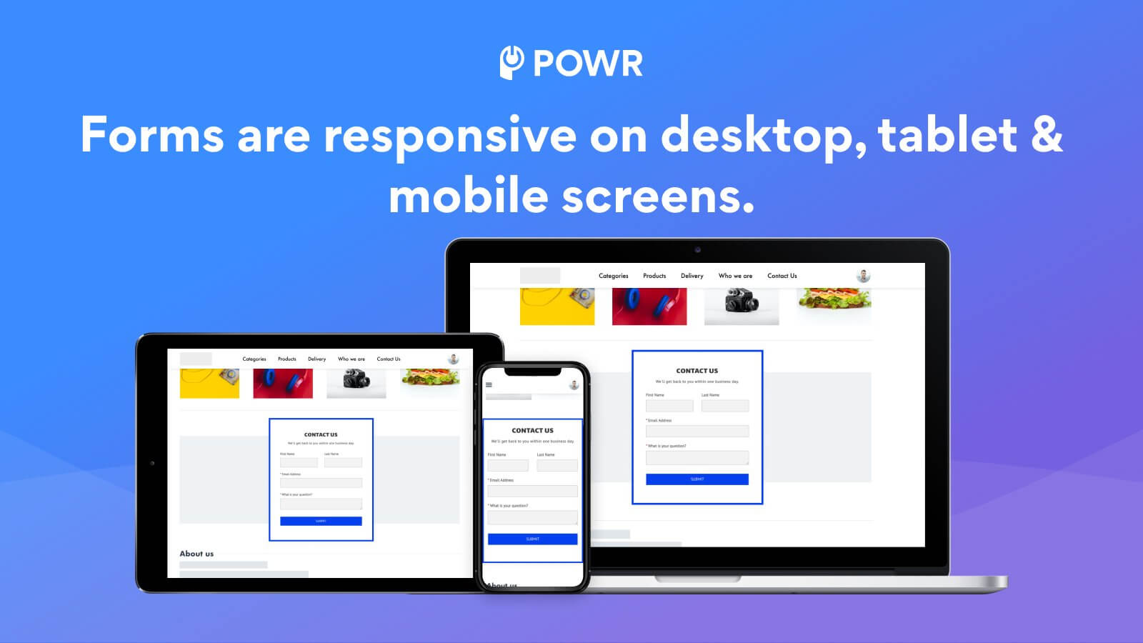
POWr Form Builder
Price: From Free
Rating: 4.7 (1132 reviews)
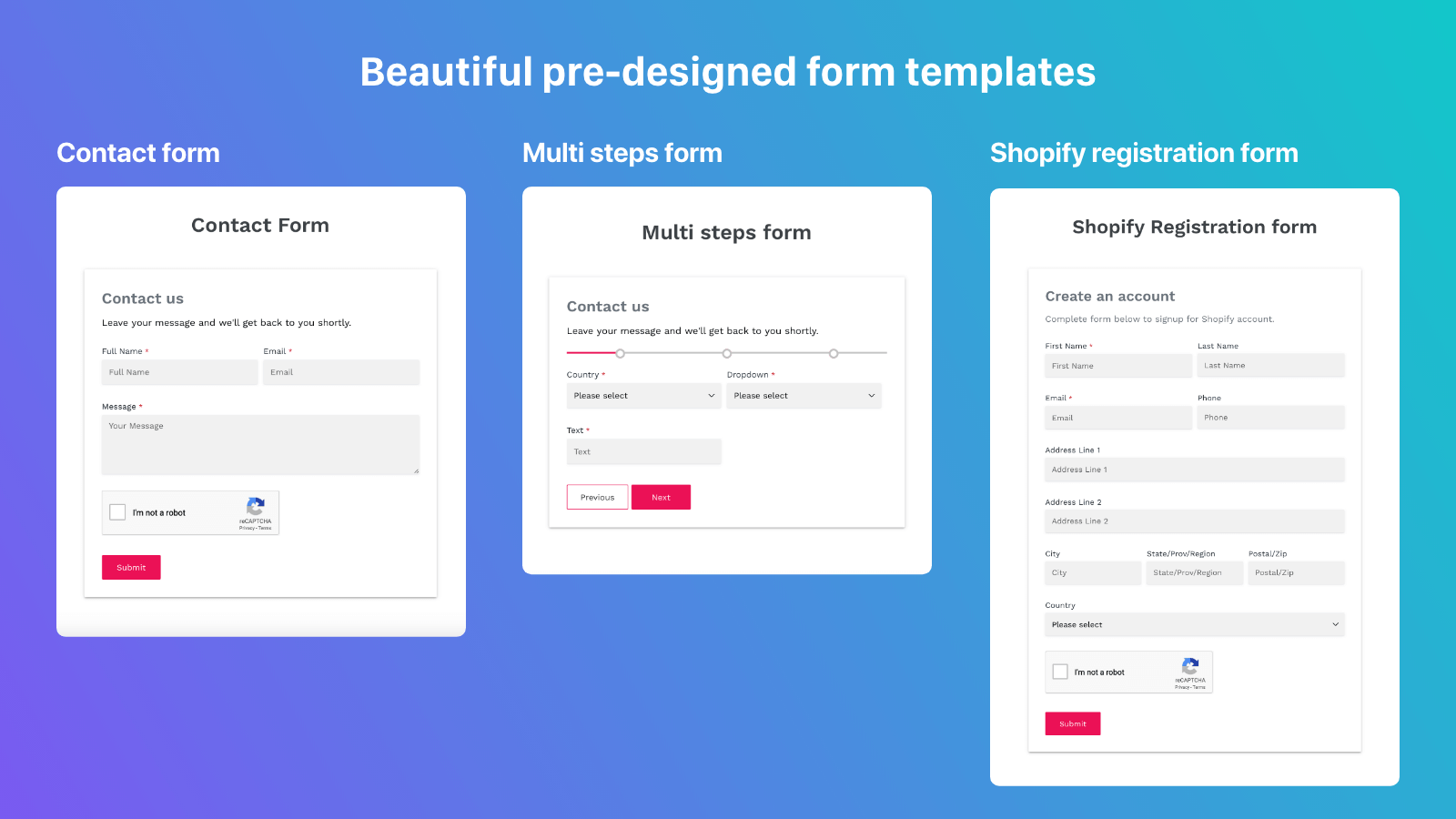
Powerful Contact Form Builder
Price: Free
Rating: 4.7 (248 reviews)
HelpCenter
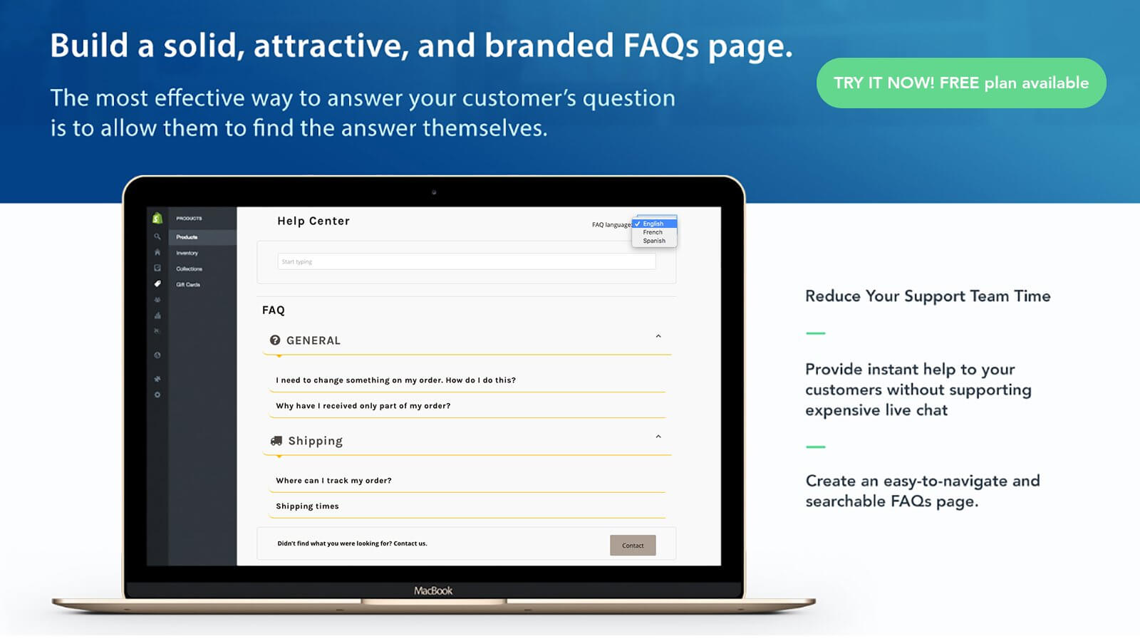
Price: From Free
Rating: 4.8 (1097 reviews)
Contact Us Form with Captcha

Price: From Free
Rating: 4.7 (213 reviews)
Best examples of Contact Us page
The best way to sum up the whole article would be to show you the best examples of contact us pages from other Shopify stores.
This will show you how to stick to the best practices (in practice 😉) and basically embody all the tips mentioned above.
Glossier
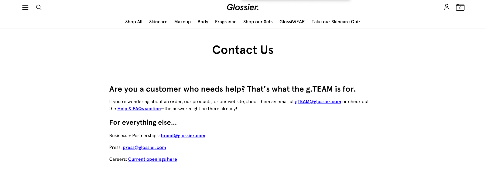
The first one is Glossier that we’ve already mentioned in the article.
Even though Glossier doesn’t include a contact form, it does a great job of guiding a visitor towards the right way of contact.
As you can see there are four different email addresses in their contact us page. Yet, these are structured in a way that there’s no problem finding the right one.
Adding a phone number for your customers would make it a great contact us page. Still, there’s a lot to take away from Glossier’s contact us page.
UNTUCKit
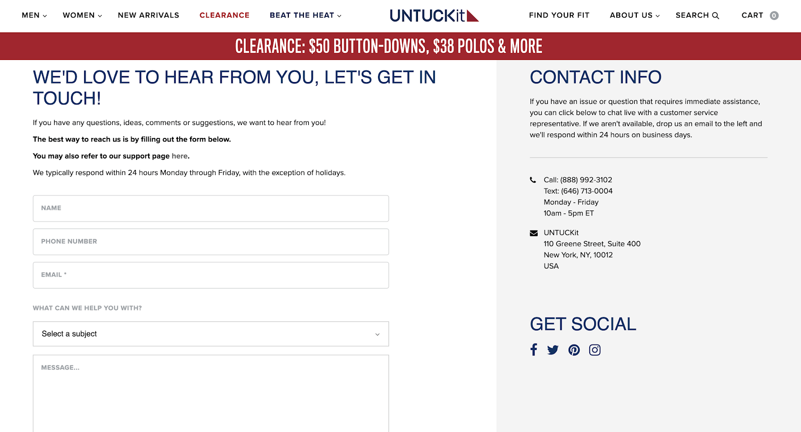
UNTUCKit includes everything a visitor (no matter their goal) may want to find on the contact us page.
There’s a clear description of what to use in which scenario. Plus, there’s a brief description of how their customer support operates.
You can use a contact form (protected by reCaptcha), have two phone numbers (one for text, one for calls), physical address, and social media handles.
Great job and great example!
Package Free
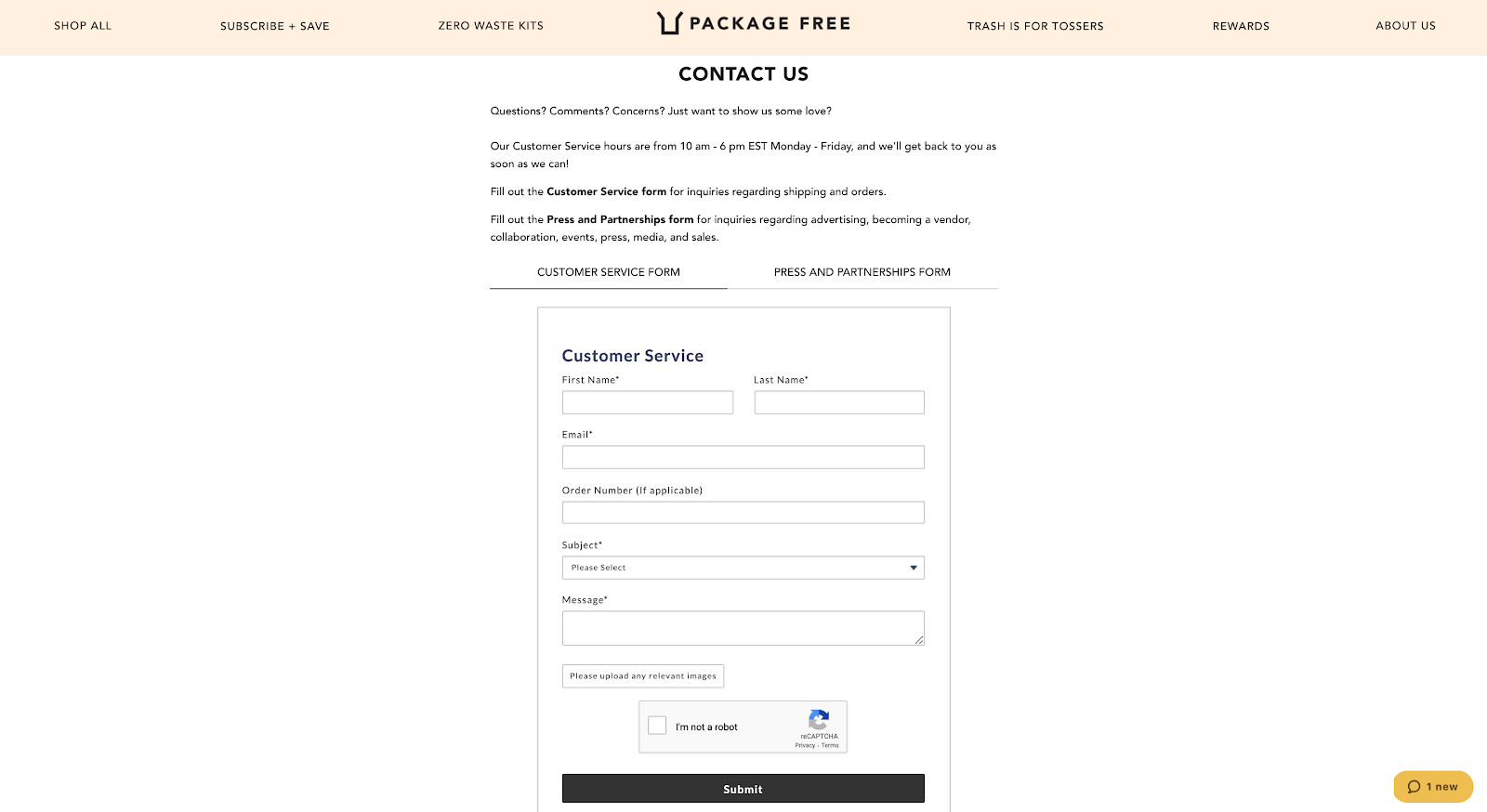
Package Free is another store that serves as a great example in one of the principles. Here, they show a great workaround way to power up a contact form.
Namely, Package Free utilizes contact forms as their main way of contact (besides the live chat in the right-bottom corner). To make it simpler for visitors, they allow you to choose between two different forms. One for customer service requests and one for press and partnerships.
Instead of blasting a few email addresses (although that can be done right, look up Glossier) they make great use of screen real estate and pack two contact forms in the space of one.
Now you know how to make a contact us page on Shopify!
At this point, you’re ready to create your own contact us page on Shopify.
Follow the best practices, remember the why behind the how and how behind the what. Plus, with the best examples, you’ll never get lost!
And remember to always use the best tools that are out there…
Try Channels – phone system that integrates with your Shopify store
Channels is a data-driven phone system that connects with your Shopify store so you know every customers’ details upfront…
How?
Channels collects customer data that you store in Shopify and makes it accessible through a neat tool called Customer Card. This appears every time you handle a customer call.
With all the details such as call recordings, full name, and latest orders you’ll be able to solve your customers’ problems in minutes if not seconds!
On top of that, you get all the essential features of a phone system such as:
- Mobile app
- Virtual phone numbers
- Free Incoming calls
- IVR/Auto-attendant
- Click-to-call
- Call recordings
You can try Channels for free for 7 days. Plus, we give you a free phone number and a few $$$ so you can fully test our software!


